
A great law firm logo is a clean, distinctive, and professional visual signature that helps clients recognize the firm across websites, search profiles, social media, business cards, office signage, and other marketing materials.
Typography determines how clearly the firm name is presented. Serif typefaces often support a traditional legal identity, while modern sans-serif typefaces support a cleaner contemporary identity. The best choice depends on the firm’s positioning rather than a universal rule that one font category creates more trust than another.
Color gives the logo visual character and helps establish the wider brand palette. Blue, navy, black, gray, green, burgundy, and other restrained colors frequently appear in professional services branding, but no single color automatically conveys trust, authority, or client confidence. Color selection must fit the firm’s positioning, audience, practice areas, and surrounding website design.
Simplicity improves usability across formats. A law firm logo needs enough visual distinction to be recognizable without depending on tiny details that disappear in a website header, mobile screen, favicon, social avatar, embroidered item, or printed business card.
Versatility also matters because one logo rarely fits every placement. A complete law firm logo system often includes a primary horizontal version, a stacked version, a simplified icon or monogram, a monochrome version, and light-background and dark-background variations.
A logo contributes to the first impression of a law firm because it appears alongside the firm’s name, attorneys, website, advertisements, directories, and client communications. The logo does not prove legal expertise, but an inconsistent, distorted, difficult-to-read, or generic visual identity weakens the professional presentation surrounding that expertise.
A study by Satyendra Singh from the journal Management Decision, titled “Impact of color on marketing” in 2006, demonstrates that people make up their minds about products or brands within 90 seconds of their initial interaction, and between 62% and 90% of that assessment is based on color alone.
Law firms must also avoid clichés when those elements make the brand indistinguishable from competitors. Scales of justice, gavels, courthouse columns, shields, and generic legal icons work when they are adapted into a distinctive identity, but they must not be used automatically simply because the business is a law firm.
Professional logo design therefore connects typography, color, simplicity, scalability, versatility, distinctiveness, and consistent application into one recognizable visual system.
Table of Contents
- Article sections will appear here.
What Are Law Firm Logos?
Law firm logos are visual identifiers that represent a law firm’s name and brand across digital platforms, print materials, advertising, signage, and client-facing materials. A law firm branding strategy connects the logo with the firm’s wider visual identity, including typography, colors, photography, messaging, and attorney presentation.
A law firm logo uses the firm name as a wordmark, the firm’s initials as a monogram, a separate visual symbol, an abstract brand mark, or a combination of text and symbol. A firm named “Marshall Bennett LLP,” for example, uses the full firm name as its primary wordmark and an “MB” monogram for social media profiles or favicons. The logo identifies the law firm and creates a consistent visual reference across brand touchpoints.
How Can a Law Firm Logo Strengthen Brand Identity?
A law firm logo can strengthen brand identity by giving the firm a consistent visual identifier that clients associate with the firm across repeated interactions. A prospective client encounters a law firm through Google Search, the firm’s website, an attorney profile, email communication, a consultation, and client documents. Consistent visual presentation connects each interaction to the same organization. A study by Pamela Henderson and Joseph Cote from the Journal of Marketing, titled “Guidelines for Selecting or Modifying Logos” in 1998, analyzed 195 logos across 13 design characteristics and found that naturalness, harmony, and elaborateness affected logo recognition and image communication.
Listed below are 10 brand elements that a law firm logo coordinates with.
- Website colors.
- Typography.
- Social media graphics.
- Email signatures.
- Presentation templates.
- Business cards.
- Letterhead.
- Digital advertisements.
- Office signage.
- Client documents.
A law firm logo strengthens brand identity through visual coherence, recognition, and consistent presentation across client touchpoints.
What Elements Make a Good Law Firm Logo?
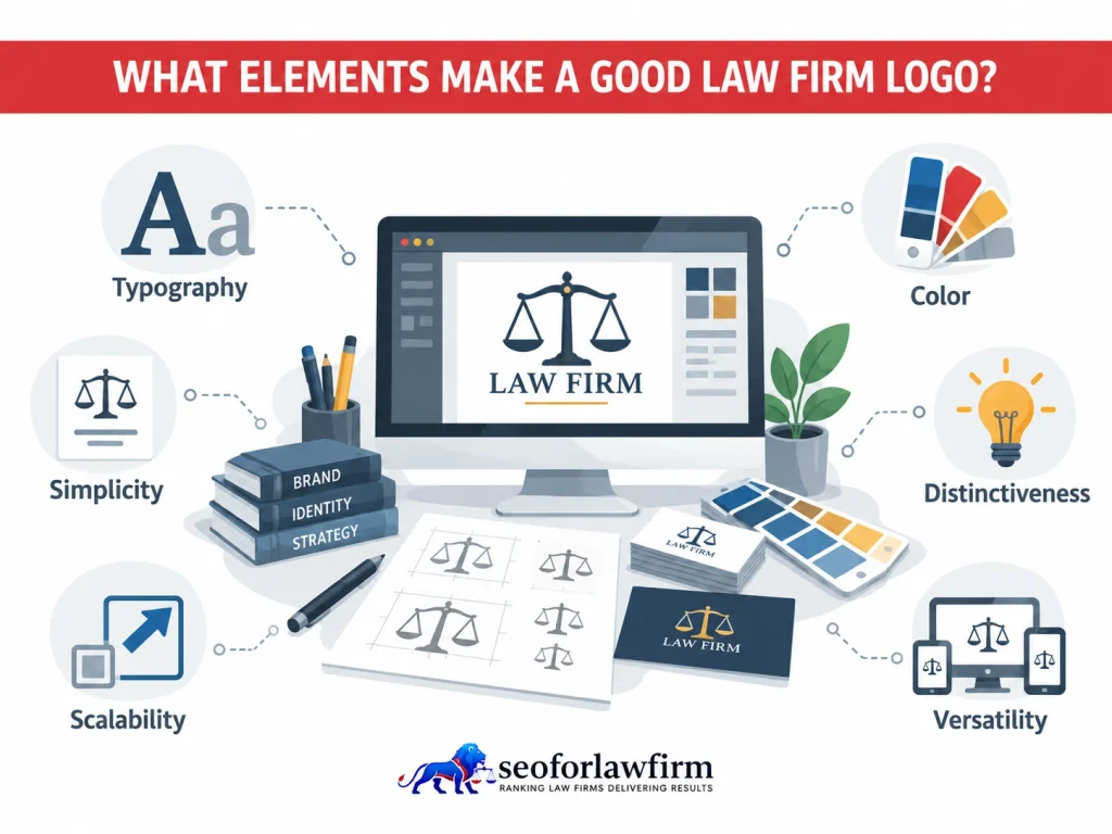
The elements that make a good law firm logo are readable typography, an appropriate color palette, visual simplicity, distinctiveness, scalability, and versatility across different applications.
Listed below are the 6 main elements of effective law firm logo design.
- Readable Typography: The firm name needs to remain identifiable across large signage, website headers, email signatures, and smaller mobile applications.
- Appropriate Color Palette: Colors must support the firm’s positioning and remain usable across digital, print, light-background, dark-background, and monochrome applications.
- Visual Simplicity: The design must avoid details that disappear when the logo becomes small or visually cluttered.
- Distinctiveness: The logo needs sufficient individual character to avoid looking interchangeable with competing firms.
- Scalability: The mark must maintain clarity from a favicon or social avatar to office signage.
- Versatility: The logo system must provide suitable versions for horizontal, vertical, compact, monochrome, dark, and light applications.
How Does Typography Affect Law Firm Logo Design?
Typography affects law firm logo design by determining how clearly the firm name is read and what visual character the brand communicates. Serif typography supports law firm identities associated with tradition, institutional history, or editorial formality, while sans-serif typography supports identities associated with simplicity, modernity, directness, or digital-first presentation. Neither style is automatically better for attorneys because different law firms require different visual personalities.
A litigation boutique favors a more formal typographic style, while a technology-focused law firm prefers a cleaner and more modern presentation. Decorative fonts reduce readability when letterforms become difficult to recognize. Logo typography also does not need to match the website body font because both type systems remain visually coordinated without being identical.
Listed below are the 9 typography factors law firms must evaluate when designing a logo.
- Legibility: The firm name must remain easy to read across digital and print applications.
- Letter spacing: Spacing must keep letters distinct and prevent the wordmark from appearing crowded or disconnected.
- Font weight: The font weight must remain visible without making the logo appear too heavy or too light.
- Capitalization: Uppercase, lowercase, or mixed-case lettering changes the visual tone of the firm name.
- Firm-name length: Longer firm names require tighter spacing, different sizing, or a secondary logo variation.
- Initials: Initials support monograms and compact logo applications.
- Screen rendering: The typography must remain clear on websites, mobile devices, and digital advertisements.
- Small-size performance: The logo must remain readable when reduced for favicons, social media profiles, or document headers.
- Compatibility with website typography: Logo typography must visually coordinate with the fonts used across the law firm’s website.
What Colors Work Best for Law Firm Logos?
The best law firm logo colors are colors that match the firm’s positioning, maintain legibility across applications, and provide enough contrast to preserve the logo’s visual identity. Professional-services firms often use navy, blue, black, gray, deep green, burgundy, purple, gold accents, and neutral combinations, but these colors represent design conventions rather than fixed psychological effects.
Blue does not automatically make clients trust a law firm, black does not automatically communicate sophistication, and green does not automatically communicate growth. Color meaning depends on context, culture, surrounding design, industry conventions, and previous brand exposure. The logo must also remain recognizable when full color is unavailable.
Listed below are the 7 color components a law firm logo palette includes.
- Primary brand color.
- Secondary brand color.
- Accent color.
- Neutral supporting colors.
- Monochrome version.
- Light-background version.
- Dark-background version.
Why Does Simplicity Matter In Law Firm Logo Design?
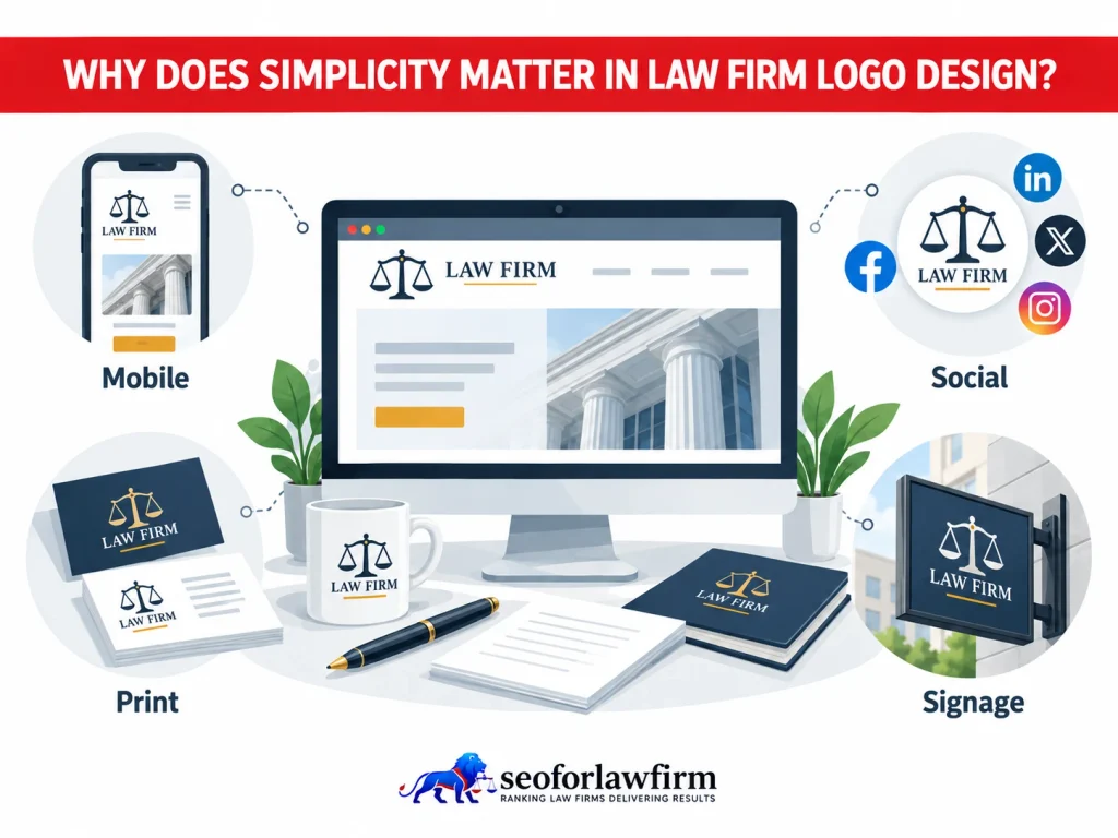
Simplicity matters in law firm logo design because the logo needs to remain recognizable and usable across different sizes and environments without relying on fine visual detail. A complicated courthouse illustration looks clear on a presentation cover but becomes difficult to recognize inside a small mobile navigation bar. A simpler law firm logo adapts more easily across digital, print, and physical applications because fewer visual details reduce clutter at smaller sizes.
Listed below are the 9 applications where simple law firm logo design supports clearer presentation.
- Mobile headers: A simple logo remains recognizable within limited screen space.
- Favicons: A compact mark preserves identity at very small dimensions.
- Social profile images: A simple symbol or monogram remains visible inside circular or square profile frames.
- Directory thumbnails: Reduced detail helps the firm remain identifiable in small listing images.
- Email signatures: A simple logo maintains clarity without overpowering contact information.
- Business cards: A clean mark fits small print layouts without losing legibility.
- Embroidery: Fewer fine details reproduce more accurately on fabric.
- Signage: Simple forms remain easier to recognize from a distance.
- Digital advertisements: A clear logo communicates the firm identity within limited ad space.
Simplicity does not mean that the fewest possible elements always produce the strongest logo. A study by Bo van Grinsven and Enny Das from the Journal of Marketing Communications, titled “Logo design in marketing communications: Brand logo complexity moderates exposure effects on brand recognition and brand attitude” in 2014, analyzed the visual dynamics of logo design and found that simpler logos provided immediate, short-term processing benefits, whereas more complex logos required repeated exposure over time to unlock their full recognition benefits and establish positive brand attitudes. Law firm logo design therefore benefits from controlled complexity that creates distinction without adding unnecessary visual noise.
How Does Readability Affect Law Firm Logo Design?
Readability affects law firm logo design by determining whether clients identify the firm name quickly across websites, mobile devices, printed materials, advertisements, and signage. Readability becomes more important when a law firm name contains several visual or textual elements that make the logo harder to scan at a glance.
A law firm must test the logo at different real-world sizes before approval because the same logo configuration does not work equally well in every format. A long horizontal firm name, for example, requires a compact monogram for small spaces while retaining the full wordmark for larger applications. A responsive law firm website design must also keep the logo appropriately sized so the logo remains identifiable without dominating the mobile screen.
Listed below are the 10 factors and applications law firms must evaluate for logo readability.
- Several partner names: Multiple names make the logo longer and harder to read at smaller sizes.
- Long surnames: Long surnames require careful spacing and sizing to preserve clarity.
- Multiple initials: Several initials become difficult to distinguish when spacing or letterforms are too compact.
- LLP or PLLC designations: Legal designations add visual length and must remain secondary to the main firm name.
- Taglines: Taglines reduce clarity when they compete with the firm name for attention.
- Multiple office locations: Location references create visual clutter when too many cities or offices appear within the primary logo.
- Website headers: The logo must remain readable without occupying excessive horizontal space.
- Mobile headers: The logo must remain identifiable within limited screen space.
- Business cards: The firm name and logo details must remain clear at small print sizes.
- Social avatars: A compact logo or monogram must remain recognizable within a small profile image.
- Building signs: The logo must remain legible when viewed from a distance.
Why Does Versatility Matter in Law Firm Logo Design?
Versatility matters in law firm logo design because one logo configuration rarely performs equally well across website headers, social profiles, favicons, print materials, documents, advertisements, and physical signage. A versatile law firm logo system uses several coordinated versions of the same visual identity so the firm remains recognizable across different sizes, backgrounds, and formats.
Each version must preserve the same typography, colors, symbols, and brand character rather than appear as an unrelated logo. A defined logo system also prevents staff members, vendors, printers, advertisers, and website developers from creating inconsistent variations.
The table below shows common law firm logo versions and their primary applications.
| Logo Version | Primary Application |
| Horizontal logo | Website headers and letterhead |
| Stacked logo | Square or narrow layouts |
| Icon or monogram | Social profiles and favicons |
| Full-color logo | Primary digital and print brand applications |
| Monochrome logo | Legal documents, engraving, and limited-color printing |
| Light version | Dark backgrounds |
| Dark version | Light backgrounds |
How Do Law Firm Logos Create Client Confidence?
Law firm logos support client confidence by giving the firm a professional and consistent visual presentation, but the logo itself does not prove legal competence or trustworthiness. Client confidence depends on broader evidence such as attorney qualifications, relevant experience, clear communication, reviews, case results where ethically and legally appropriate, and transparent business information.
The logo frames these signals visually and helps the firm present them under one recognizable identity. A distorted logo, inconsistent colors, pixelated image, or mismatched branding across channels make the firm appear poorly managed. A strong law firm logo supports credibility by reinforcing consistency, but the logo does not replace the evidence that establishes credibility.
Listed below are the 9 factors that contribute to client confidence in a law firm.
- Attorney qualifications: Credentials show the education, licensing, and professional background of the attorneys.
- Relevant experience: Experience demonstrates the firm’s familiarity with specific legal matters and practice areas.
- Practice-area information: Clear service information helps clients understand what legal matters the firm handles.
- Clear communication: Direct and consistent communication helps clients understand the legal process and the firm’s role.
- Reviews: Client feedback provides social proof about previous experiences with the firm.
- Case results: Permitted case results show prior outcomes when presented in compliance with applicable advertising rules.
- Office information: Accurate office details help clients verify the firm’s physical presence and service locations.
- Professional website design: A well-structured website supports a consistent and credible digital presentation.
- Transparent contact information: Clear phone numbers, email addresses, and contact options make the firm easier to verify and reach.
How Does a Law Firm Logo Affect Marketing and Client Perception?
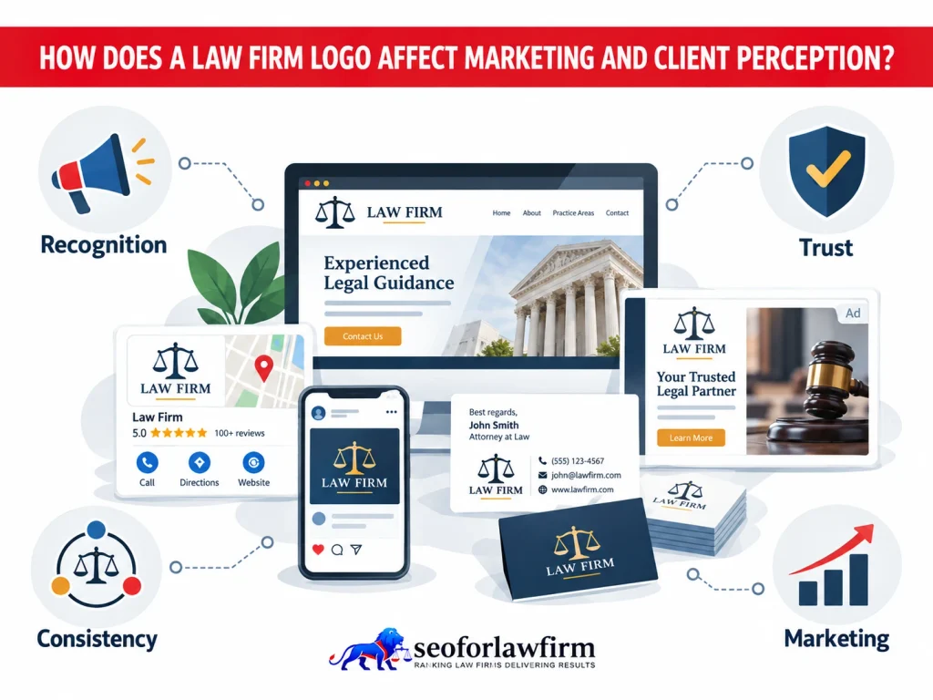
A law firm logo affects marketing and client perception by making the firm easier to identify and by creating a consistent visual reference across advertising, search, websites, social media, email, print, and client communications. Repeated visual consistency helps prospective clients connect different encounters with the same law firm and reinforces recognition across client-acquisition channels.
Logo consistency does not directly improve organic Google rankings or guarantee higher conversion rates because marketing performance depends on the combined effect of the audience, message, offer, reputation, website, intake process, and brand presentation. The logo supports this system by giving each marketing touchpoint a recognizable visual identity. A broader law firm marketing strategy must determine where the visual identity appears and how the law firm brand works across client-acquisition channels.
Listed below are the 11 marketing channels and materials where a law firm logo appears.
- Website navigation: The logo identifies the law firm across website pages and navigation areas.
- Google Business Profile: The logo gives the firm a recognizable visual identity in local search results.
- Social media profiles: The logo connects social accounts with the same law firm brand.
- Display advertising: The logo identifies the firm within digital advertising campaigns.
- Email signatures: The logo reinforces the firm identity in attorney and staff communications.
- Legal directories: The logo helps distinguish the firm from competing listings.
- Video graphics: The logo identifies the firm in intros, outros, overlays, and branded video content.
- Business cards: The logo connects printed contact information with the firm’s visual identity.
- Sponsorship materials: The logo identifies the firm at sponsored events, publications, and community programs.
- Office signage: The logo reinforces the firm’s identity at physical office locations.
- Presentation decks: The logo creates consistent branding across presentations, consultations, and internal materials.
Should Law Firms Avoid Scales of Justice and Gavels?
Yes, Law firms should avoid scales of justice, gavels, courthouse columns, shields, and similar legal symbols when those elements make the logo look generic or too similar to competing firms. These symbols are not inherently unsuitable for law firm branding. The problem comes from predictable execution, such as generic scales paired with a generic serif font and navy blue, because that combination resembles many other legal brands.
A law firm still uses traditional legal imagery when the design gives the symbol a distinctive relationship to the firm’s name, history, location, or visual system. A law firm also does not need a legal symbol because strong typography alone creates a recognizable legal identity.
Listed below are 5 ways law firms make traditional legal imagery more distinctive.
- Custom geometry: Original shapes and proportions make a familiar legal symbol feel specific to the firm.
- Distinctive initials: Firm initials are integrated into the symbol to create a more recognizable mark.
- Unique line construction: Custom linework separates the logo from common stock-style legal icons.
- A symbol tied to the firm name: The visual mark references the firm’s name, initials, or naming history.
- A symbol tied to location or history: Local architecture, geography, or firm heritage give the logo a more specific identity.
What Are Examples of Modern Law Firm Logo Styles?
Modern law firm logo styles include typography-led wordmarks, simplified traditional marks, and combination logos designed to work consistently across digital and physical applications.
Listed below are the 5 common modern law firm logo styles.
- Typography-Led Wordmarks: Use the law firm name as the main visual asset with carefully customized typography.
- Monogram Logos: Combine partner or firm initials into a compact, recognizable mark.
- Abstract Symbol Logos: Use geometric or conceptual imagery instead of literal legal symbols.
- Modernized Legal Symbols: Simplify scales, columns, shields, or other traditional imagery into more distinctive forms.
- Combination Logos: Pair a symbol or monogram with the full firm name.
How Can Law Firms Improve Logo Clarity and Visual Impact?
Law firms can improve logo clarity and visual impact by simplifying unnecessary details, strengthening typography, improving contrast, testing scalability, and creating consistent logo variations.
Listed below are the 6 design improvements law firms must consider.
- Simplify unnecessary details: Remove decorative elements that disappear at smaller sizes.
- Strengthen typography: Choose letterforms that remain identifiable in real-world applications.
- Improve contrast: Ensure the logo remains visible against different backgrounds.
- Test small sizes: Review the logo in mobile headers, social thumbnails, and favicons.
- Create flexible versions: Prepare horizontal, stacked, icon, monochrome, light, and dark variants.
- Document usage rules: Define spacing, colors, minimum size, and prohibited alterations.
Law firms building or refreshing a small-practice website must also coordinate logo decisions with the wider solo law firm website design so typography, navigation, colors, and calls to action remain visually coherent.
Where Can Law Firms Get Professional Logo and Branding Design Services?
Law firms can get professional logo and branding design services from experienced branding designers and agencies, while SEOforLawFirm.com provides law firm SEO services that positively support the broader brand by connecting visual identity with website structure, search visibility, and content strategy. A professional law firm branding provider must understand professional-services positioning, legal marketing, competitor differentiation, typography, color systems, logo variations, digital asset delivery, brand guidelines, and website implementation.
Law firms must evaluate providers based on portfolio quality, strategic reasoning, experience with legal brands, asset quality, and the ability to create a consistent identity system across digital and physical applications. The strongest provider combines clear brand strategy with scalable design rather than relying only on attorney-focused marketing claims.
Why Does Logo Consistency Matter for Law Firms?
Logo consistency matters for law firms because clients must encounter the same recognizable visual identity across every major brand touchpoint. Consistent use of the approved logo, proportions, colors, typography, spacing, icon treatment, and background versions helps the firm maintain a stable visual identity across websites, documents, social media, advertising, signage, and other client-facing materials. Inconsistent logo use can weaken recognition and make the brand appear poorly managed. Claims that logo consistency alone increases revenue by a fixed percentage must be avoided unless research directly isolates that causal relationship.
Listed below are 7 logo consistency standards law firms must maintain.
- Same approved logo: Use the current official logo across all brand applications.
- Same proportions: Preserve the logo’s original width-to-height ratio without stretching or compressing it.
- Same core colors: Use approved brand colors consistently across digital and print materials.
- Same typography: Keep approved logo fonts and type treatments unchanged.
- Same spacing: Maintain consistent clear space around the logo.
- Same icon treatment: Use the same approved symbol, monogram, or icon across platforms.
- Appropriate background version: Use light, dark, or monochrome logo variations based on the background.
Listed below are the 8 common logo inconsistencies.
- Stretching the logo: Distorting proportions changes the appearance of the mark.
- Changing colors arbitrarily: Unapproved colors weaken visual consistency.
- Rebuilding the logo from screenshots: Low-quality recreations can introduce distortion and pixelation.
- Using outdated versions: Old logo variations create conflicting brand identities.
- Changing fonts between applications: Different typefaces make the logo system appear inconsistent.
- Adding shadows or effects: Unapproved visual effects alter the intended design.
- Cropping parts of the mark: Removing portions of the logo can reduce recognition.
- Using different monograms across platforms: Multiple unapproved monograms weaken the connection between brand touchpoints.
Can a Logo Strengthen a Law Firm’s Brand Identity?
Yes, a logo can strengthen a law firm’s brand identity by giving clients a stable visual identifier that connects the firm’s website, attorneys, communications, advertisements, documents, and physical presence. Repeated exposure builds recognition as clients encounter the same logo across different brand touchpoints.
The law firm strengthens that recognition by coordinating the logo with typography, color, photography, messaging, attorney presentation, website design, advertising, print materials, and office environments. The logo supports the broader brand system rather than representing the entire brand on its own.
What Are Lawyer Logos?
Lawyer logos are visual identifiers used by individual attorneys, solo practices, or law firms to represent the legal practice across digital and physical communications.
A solo attorney often emphasizes the attorney’s personal name, initials, signature typography, practice focus, or geographic identity, while a larger law firm often emphasizes the institutional firm name. Both approaches require clear presentation and scalability across websites, social profiles, print materials, advertisements, and signage. A lawyer logo does not need to include the word “lawyer” when the firm name and surrounding context already identify the legal practice.
What Makes the Best Law Firm Logos Stand Out?
The best law firm logos stand out through distinctive typography, clear composition, appropriate visual character, scalability, and consistent application rather than excessive detail. A strong law firm logo presents the firm name clearly, creates a recognizable visual identity, performs well across different sizes, and maintains consistent colors and proportions across digital and print applications.
The design must also match the firm’s positioning and remain visually distinct from competing firms. A law firm logo does not need to appear aggressive or luxurious because the strongest design represents the firm accurately and consistently.
Listed below are 8 characteristics that help the best law firm logos stand out.
- Clear firm name: The logo must make the firm name easy to identify.
- Distinctive visual treatment: Typography, spacing, symbols, and composition must create a recognizable identity.
- Easy identification: Clients must recognize the firm quickly across different brand touchpoints.
- Good small-size performance: The logo must remain readable on favicons, mobile headers, and social profiles.
- Consistent color reproduction: Brand colors must reproduce reliably across digital and print formats.
- Appropriate professional tone: The visual style must match the firm’s practice, audience, and positioning.
- Flexible brand variants: Horizontal, stacked, monochrome, and icon versions must preserve the same identity.
- Clear separation from competitors: The logo must avoid generic treatments that make the firm resemble other law firms.
What Are the Most Common Law Firm Logo Mistakes?
The most common law firm logo mistakes are generic legal imagery, poor readability, unnecessary complexity, excessive colors, and failure to test the logo across real applications.
Listed below are the 8 common law firm logo mistakes to avoid.
- Using generic legal clichés without differentiation.
- Choosing typography that becomes unreadable at small sizes.
- Adding too many visual details.
- Using excessive colors.
- Designing only one logo configuration.
- Stretching or altering the logo inconsistently.
- Ignoring mobile and favicon applications.
- Copying competitor visual styles too closely.
How Can Law Firms Update a Logo Without Losing Brand Recognition?
Law firms can update a logo without losing brand recognition by preserving recognizable brand elements while simplifying or modernizing the elements that no longer work effectively.
Listed below are the 7 steps for updating a law firm logo without unnecessarily disrupting recognition.
- Audit the Current Logo: Identify where the existing logo appears and which features users already associate with the firm.
- Identify Recognition Anchors: Determine whether the strongest recognizable element is the firm name, initials, color, type style, or symbol.
- Decide What Needs Improvement: Separate genuine problems such as readability or scalability from changes driven only by design trends.
- Preserve Useful Brand Equity: Retain recognizable elements that still represent the firm effectively.
- Create a Complete Logo System: Produce primary, stacked, compact, monochrome, light, and dark versions.
- Update Major Touchpoints Consistently: Replace the old logo across the website, email signatures, social accounts, directories, advertising, documents, and signage.
- Monitor Client and Marketing Performance: Check for problems such as broken brand assets, reduced recognition, incorrect search images, or inconsistent implementation after launch.
An evolutionary redesign often creates less recognition disruption than replacing every established visual element simultaneously.
How Should Law Firms Use Their Logo in Google Search?
Law firms should use their logo in Google Search by specifying the preferred organizational logo in Organization structured data on the firm’s official website. Organization structured data helps Google identify the logo associated with the law firm for eligible Search features and knowledge panels. The logo image must use a crawlable and indexable image URL and meet Google’s recommended size requirements.
Law firms must also provide an appropriate favicon because Google displays the favicon beside organic search results. Structured data helps Google interpret organization information but does not create a direct organic ranking boost. A broader law firm schema markup strategy connects the organization name, logo, website, address, and other structured business information.